
The homepage, up close
A full-length screenshot of rhovive.com. Scroll and it scrolls with you, from the headline to the footer. My notes sit beside the parts worth a closer look.
The parts of rhovive.com worth a closer look, from the headline down. Each one has a note.
-
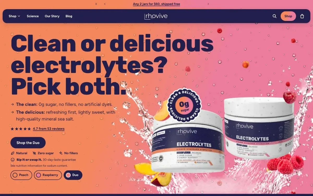
“Clean or delicious electrolytes? Pick both.”
The page opens with the choice people think they have to make, then turns it down. Both flavors sit right beside it.
-
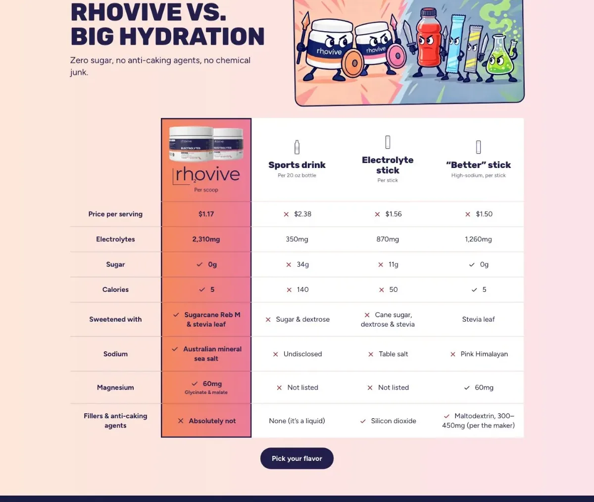
“Rhovive vs. Big Hydration”
A side-by-side table puts Rhovive against a sports drink, an electrolyte stick, and a “better” stick. Each row is something people compare: price, electrolytes, sugar, and what’s in it.
-
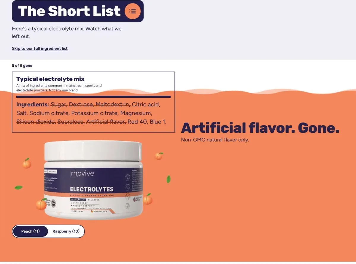
“The Short List”
A typical mix’s label sits on screen. As you scroll, each thing Rhovive leaves out gets struck through: sugar and dextrose, maltodextrin, silicon dioxide, sucralose, artificial flavor, and Red 40 and Blue 1.
-
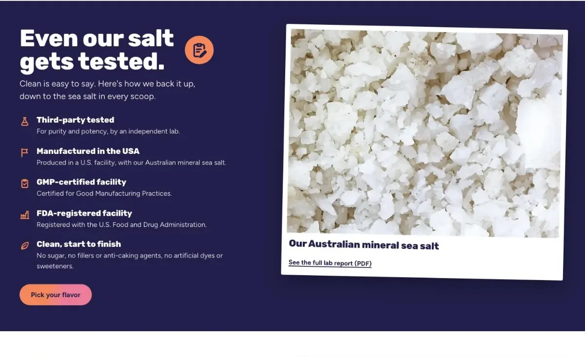
“Even our salt gets tested”
“Clean” is an easy word to use, so this section shows how it’s checked: lab testing down to the sea salt. The full lab report is one click away.


Laid out again for a phone
I worked out the phone version section by section, for one thumb and a small screen.
-
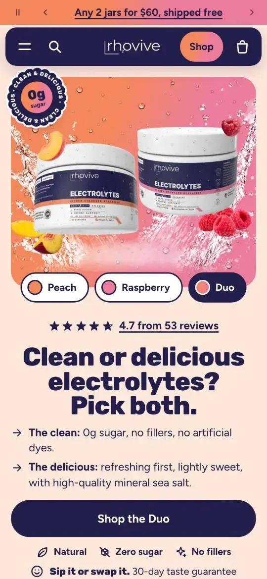
The jars come first, then the headline and the Shop the Duo button. -
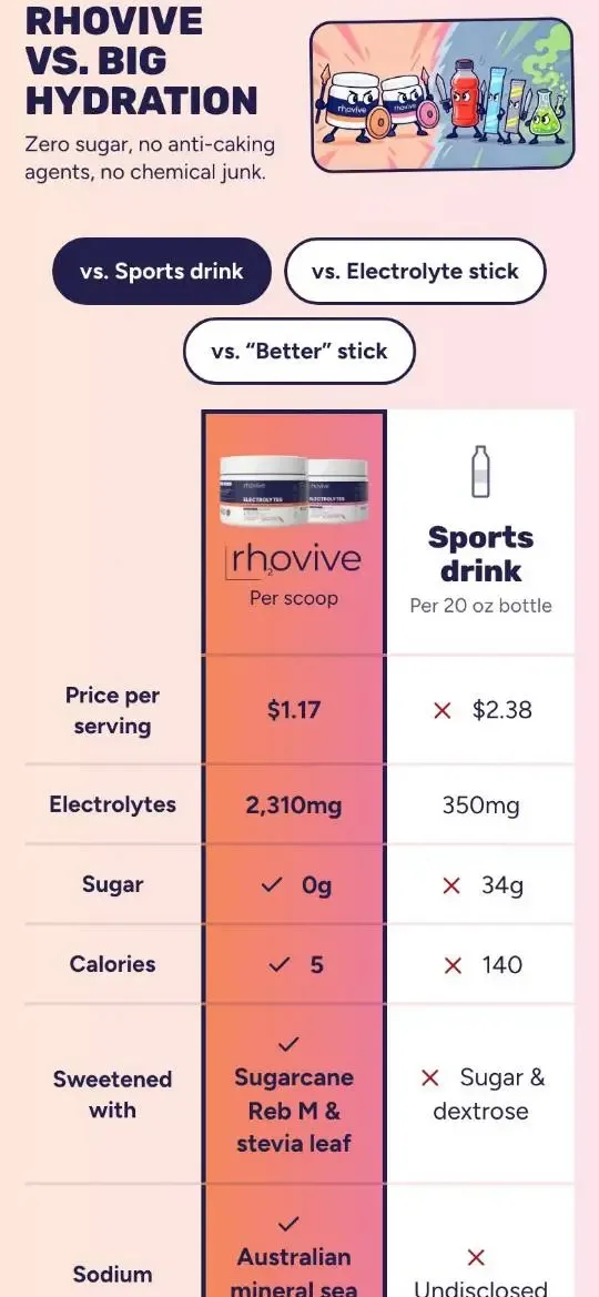
On a phone the comparison table shows one drink at a time. Buttons switch between them. -
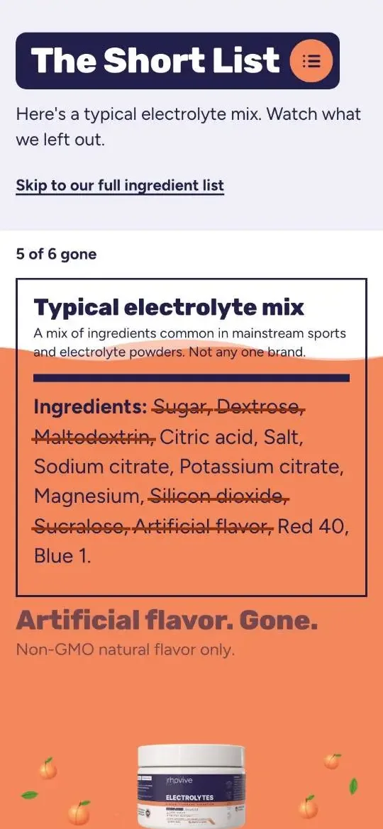
The Short List strikes ingredients off a typical label as you scroll.
How the homepage introduces itself to Google
This is the title and description I wrote for the homepage, the lines Google can show when it lists the page in search results. They make the same promise as the headline.
Rhovivehttps://www.rhovive.com
Clean, Delicious Electrolyte Powder: Pick Both | Rhovive
Clean or delicious? Pick both. 2,310mg of electrolytes per scoop, 0g sugar, no fillers or artificial dyes. Peach or Raspberry, $1.17 a serving.
The page title leads with what Rhovive is, then the headline’s promise, then the name.
The description repeats the promise, then gives the facts a shopper compares: minerals, sugar, what’s left out, flavors, and price.
What it’s built with
I built Rhovive’s store as a custom Shopify theme and wrote the code myself.
- Liquid
- Shopify’s template language, for the pages and what goes on them.
- HTML
- The markup every page is made of.
- CSS
- The look, written for this store.
- JavaScript
- The parts that move and respond to you.
- JSON
- The page templates and their settings.
The next one here could be yours.
Design, the build, search, and the words, from one person. If I’m not the right fit, I’ll tell you.
Or call (305) 401-7365